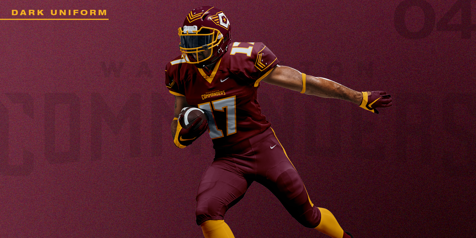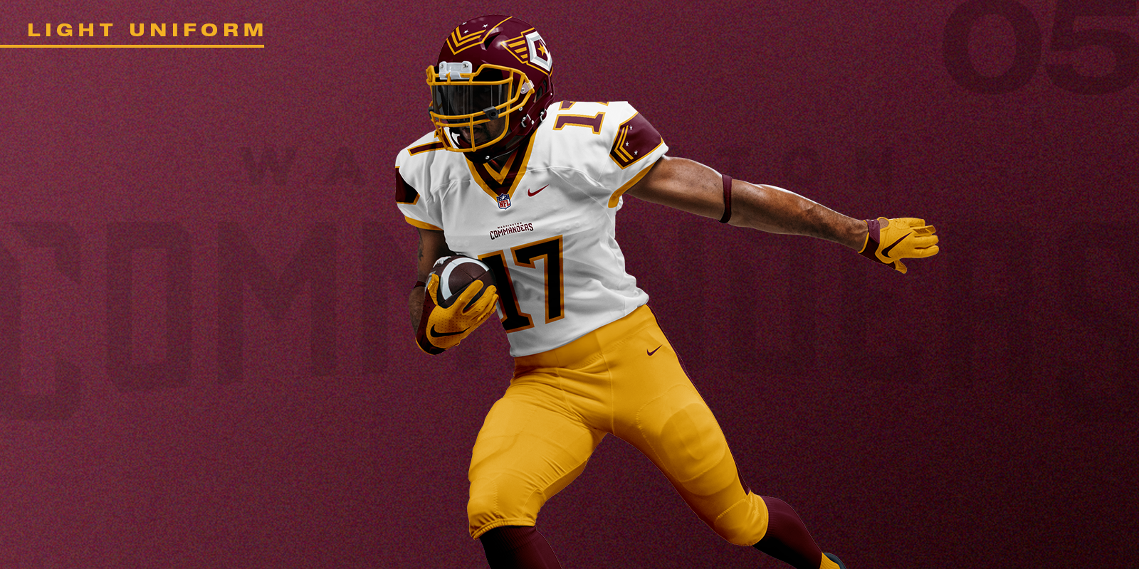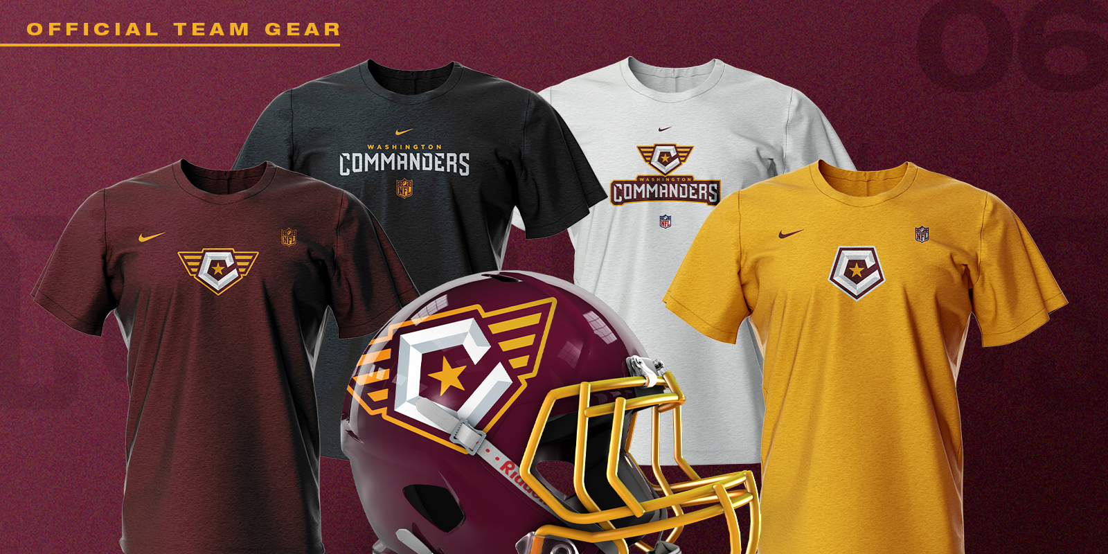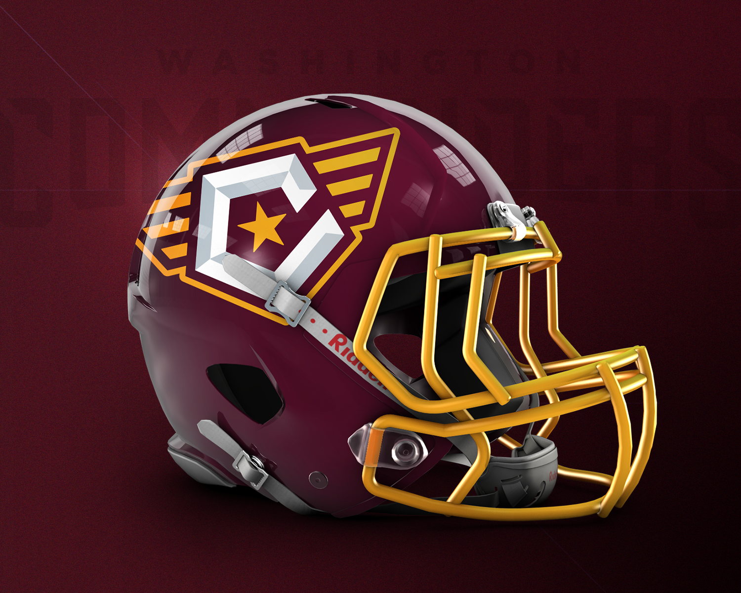
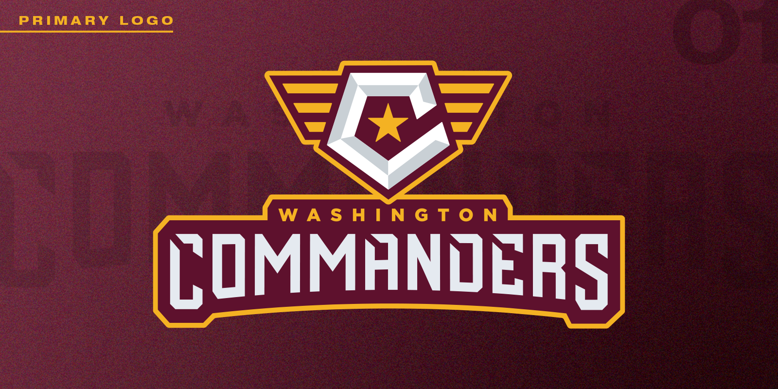
➜ With an underwhelming reception by the fanbase, the design world, and athletes alike, of the brand transition from the Washington Football Team ➧ Washington Commanders, in February 2022; specifically, the uninspired feel of the ‘Stencil-W’ primary mark as the focal point of the new look — I decided to take it upon myself, and develop a visual identity tailored more uniquely, for a young, up-and-coming talented competitor in the NFL.
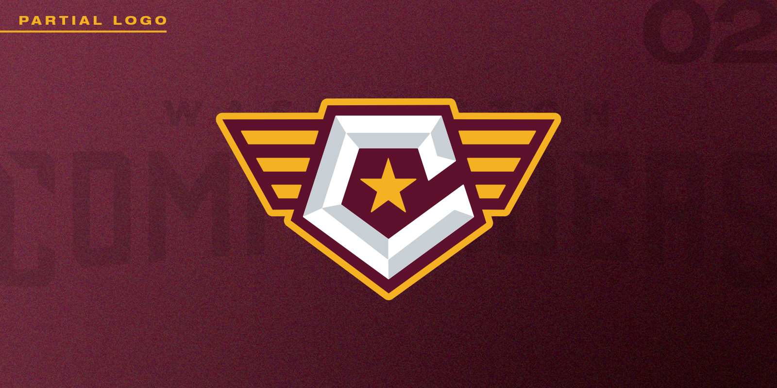
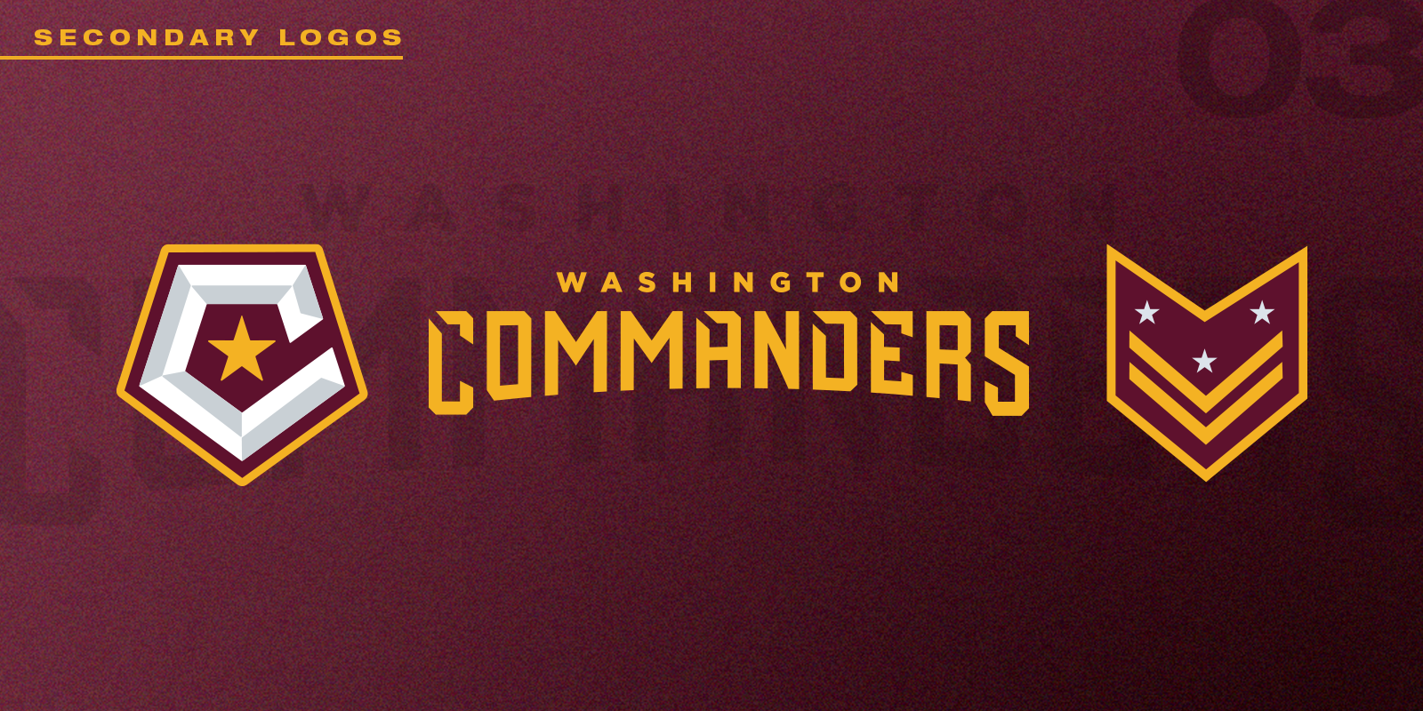
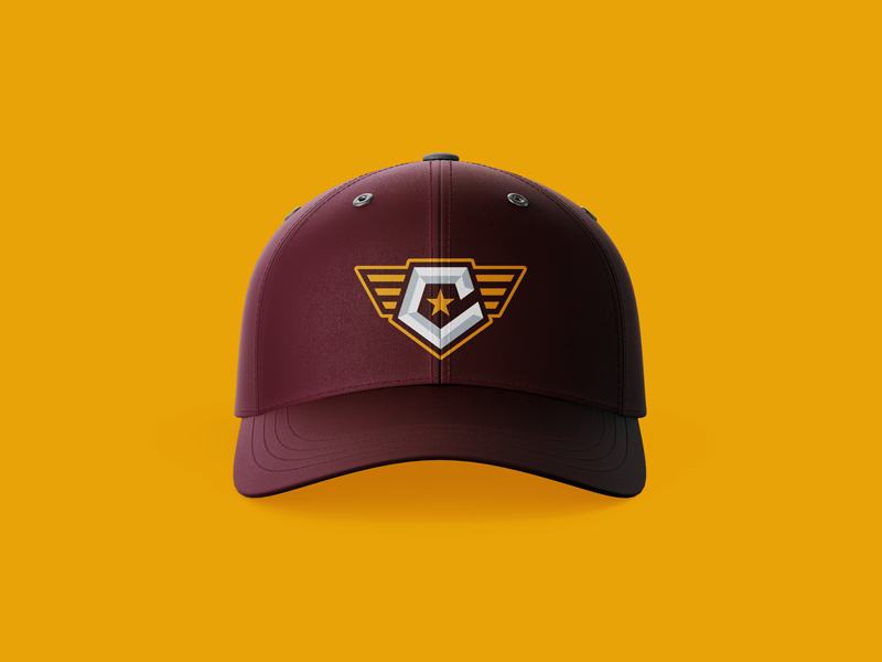
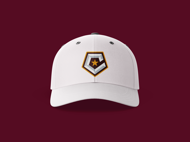
This design is set around a commander’s military patch, a beveled ‘C’ monogram rendered in the shape of the Pentagon, and a star affixed at the center of the enclosing pentagon shape, as well as a few other ‘easter eggs,’ which long-time fans of Washington’s NFL team, and more broadly, DC sports & culture should notice, visible throughout the conceptual branded elements.