
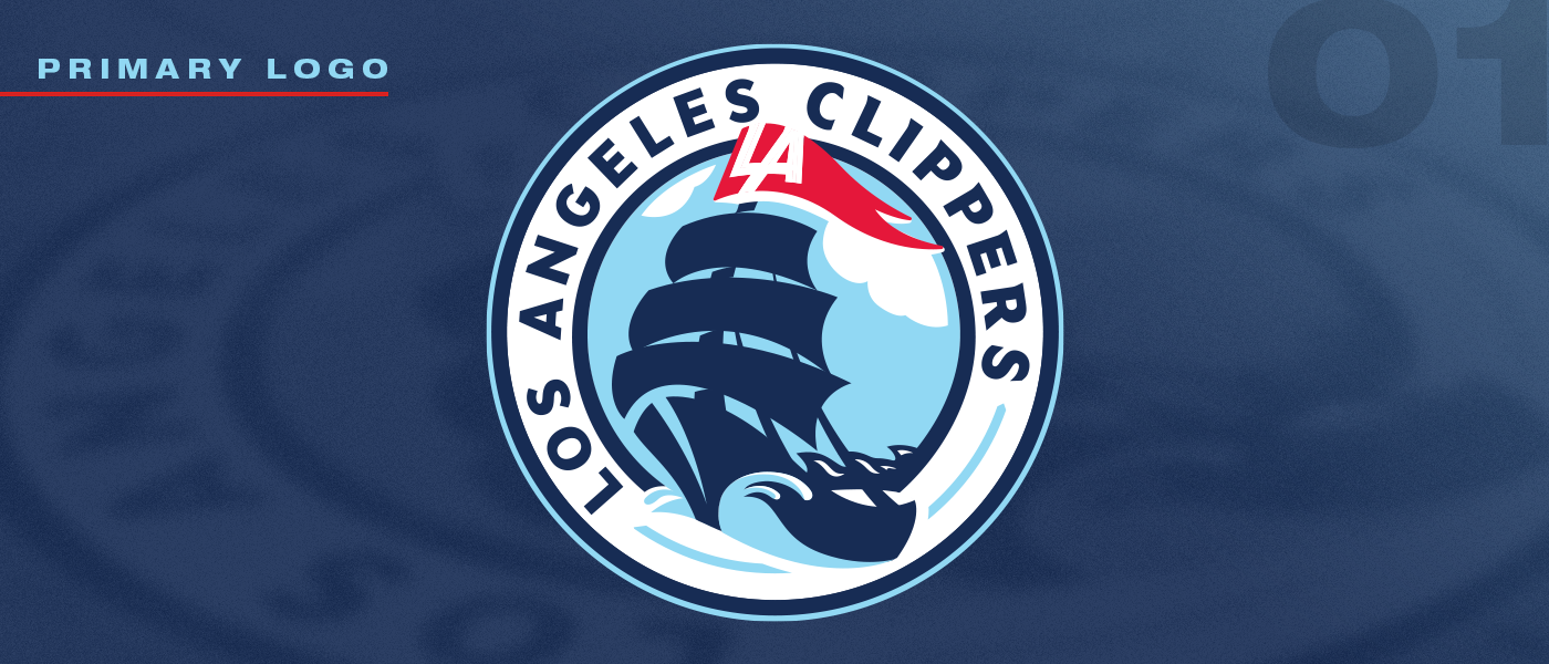
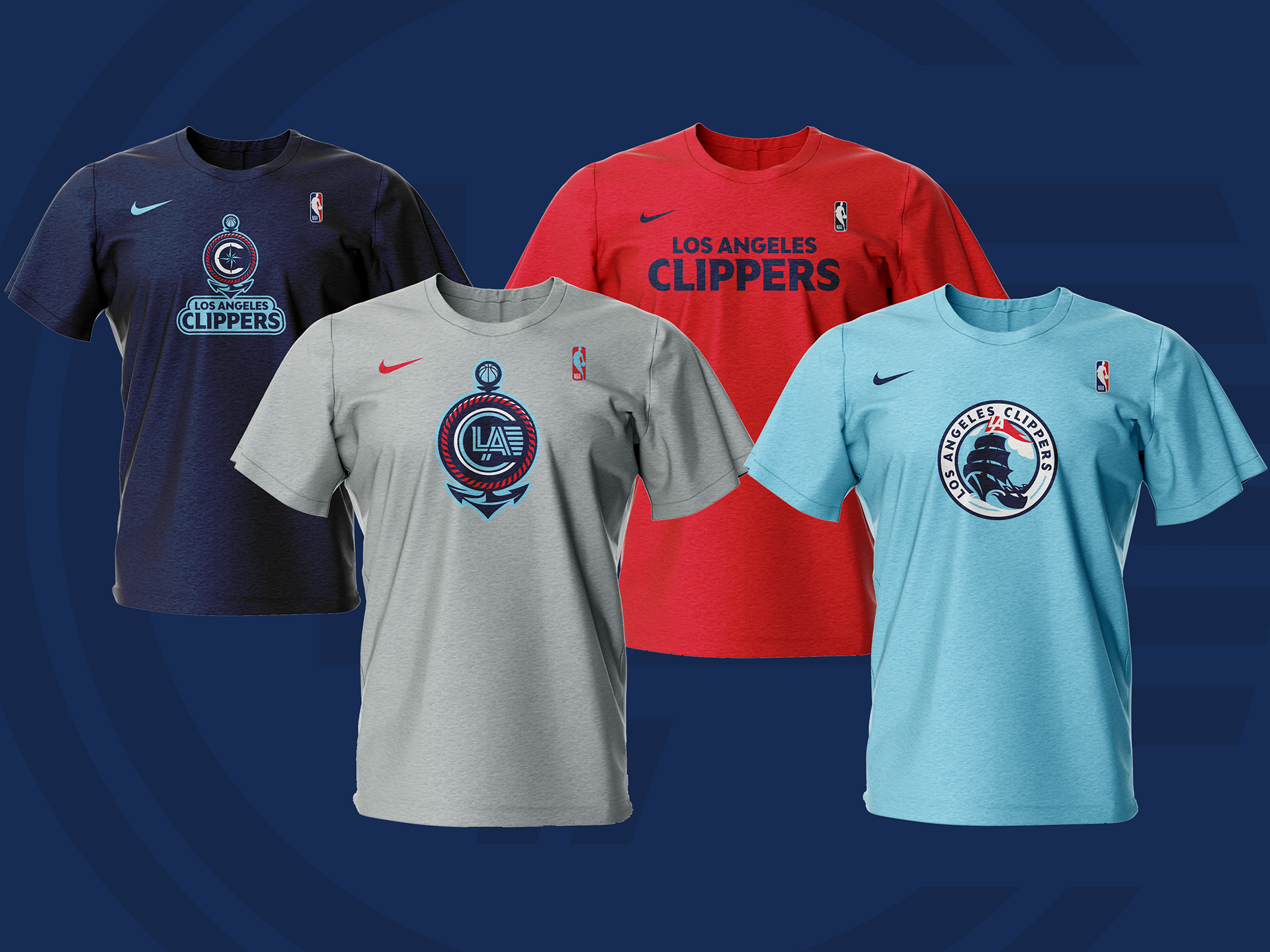

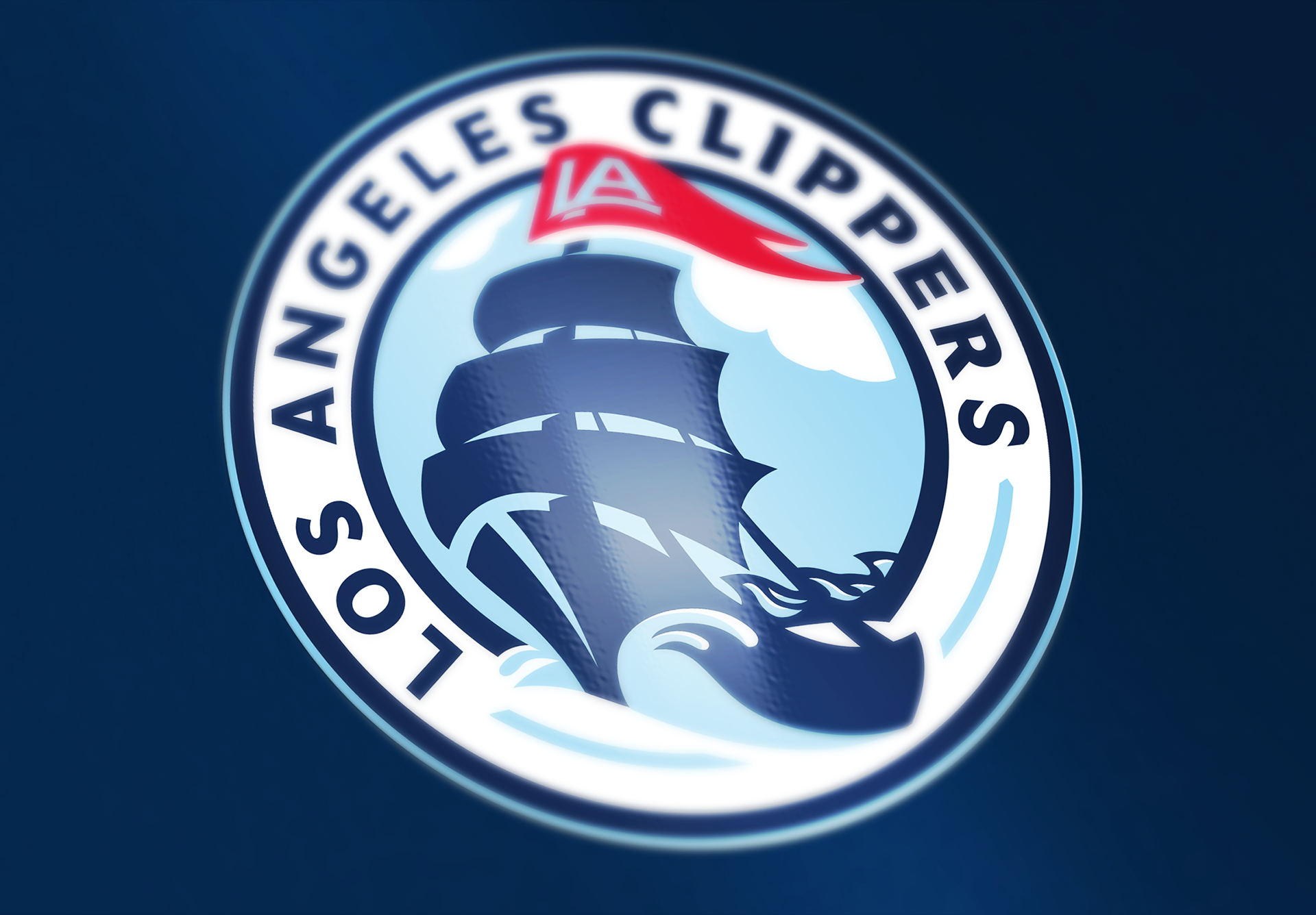
Alternate Primary Logo 1
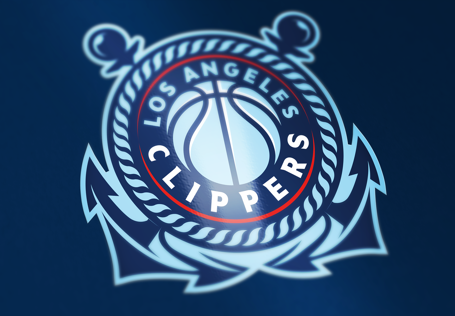
Alternate Primary Logo 2
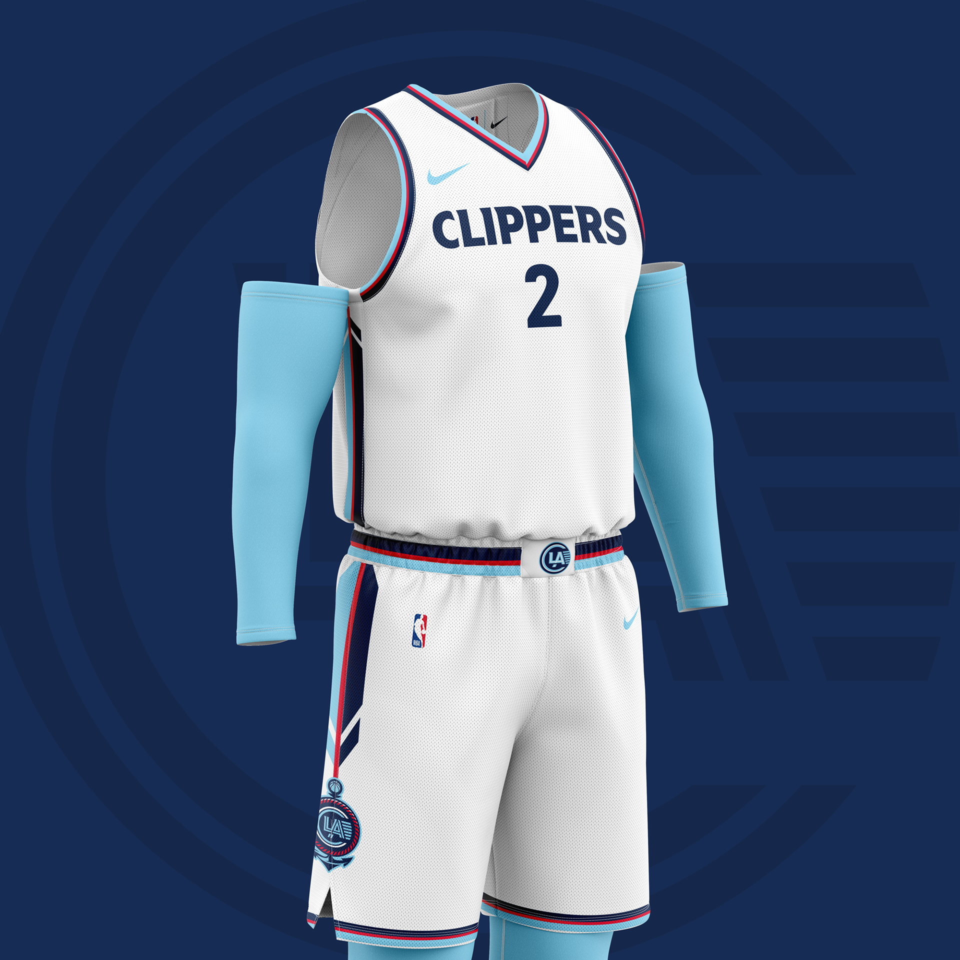
Primary Logo Mockup
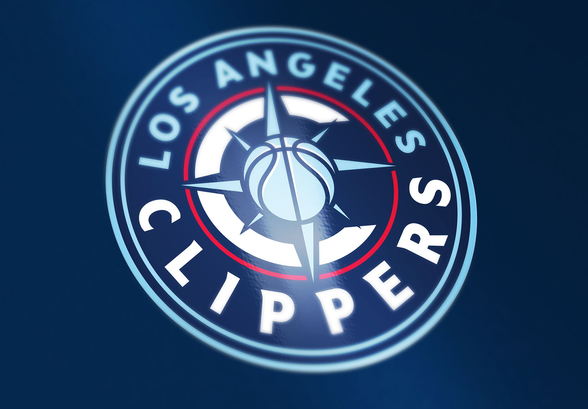
Alternate Primary Logo 3
Alternate Primary Logo 4
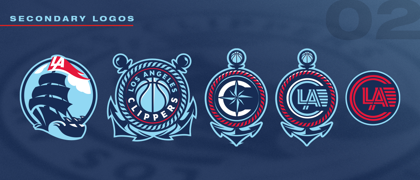
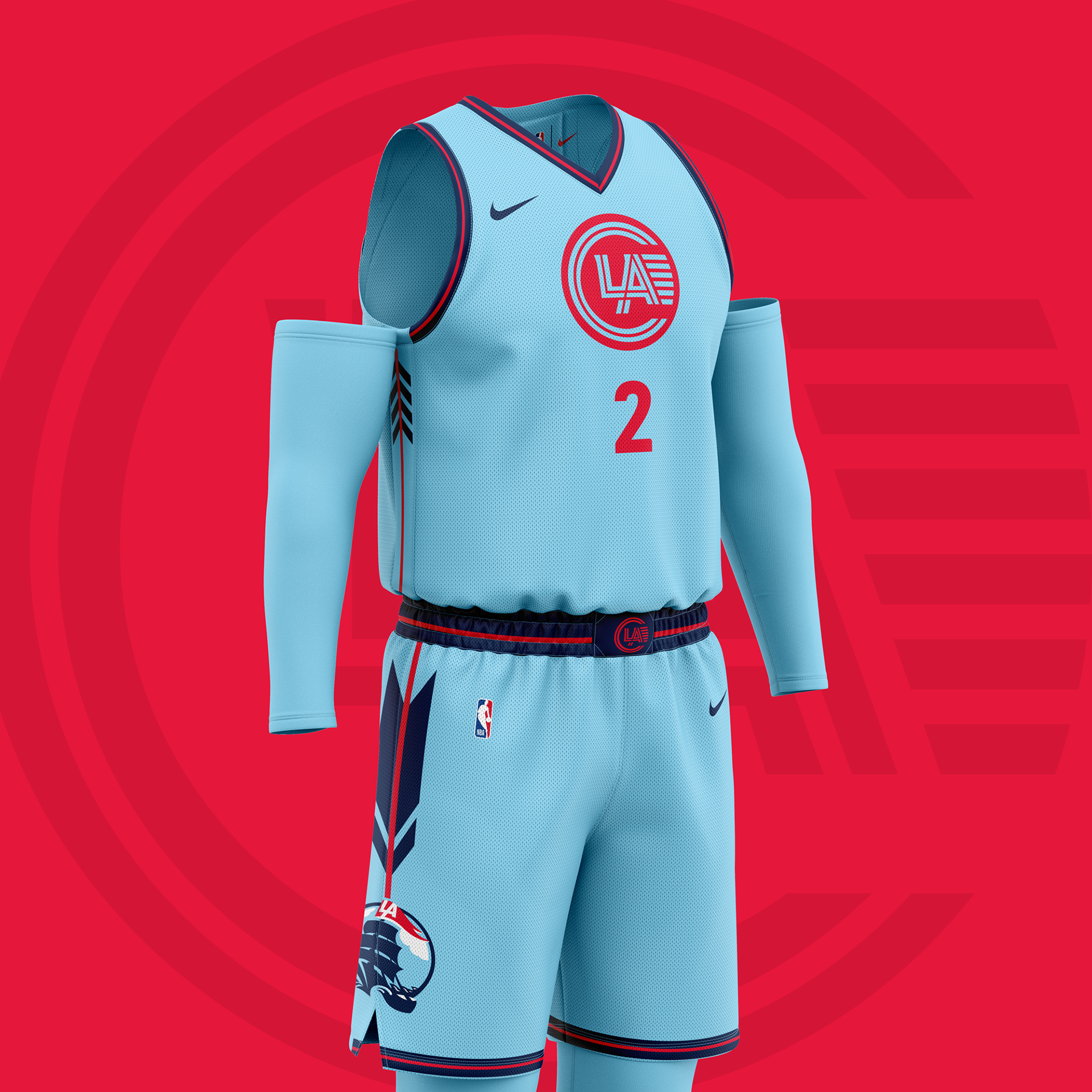
Secondary Logo Mockup
In March 2025, after the Clippers launched another rebrand prior to the season, I took some time to update the concept, which is shown above.
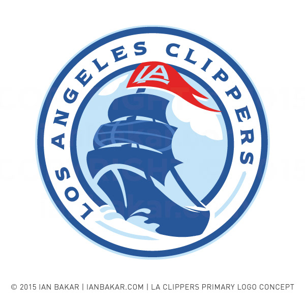
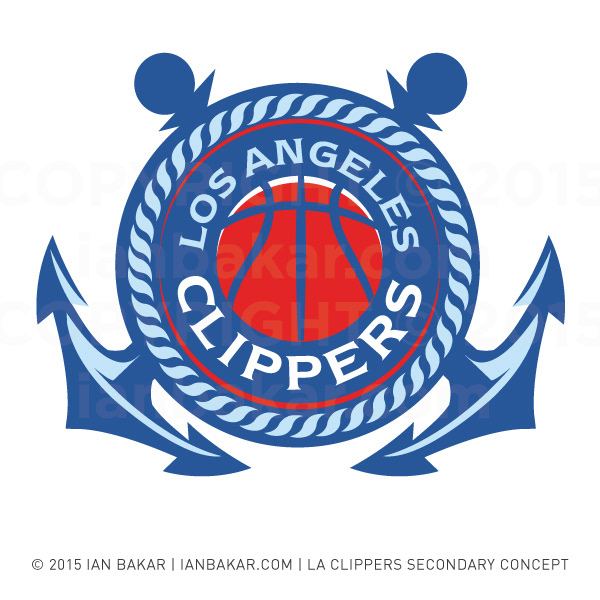
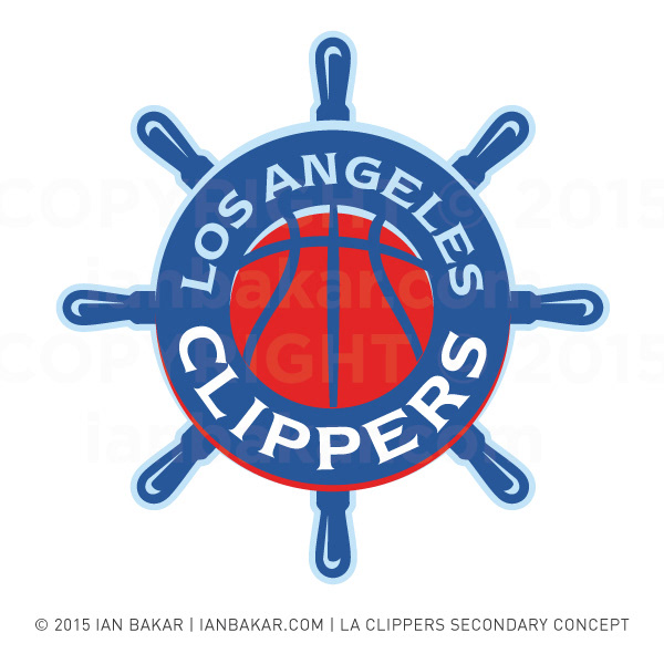
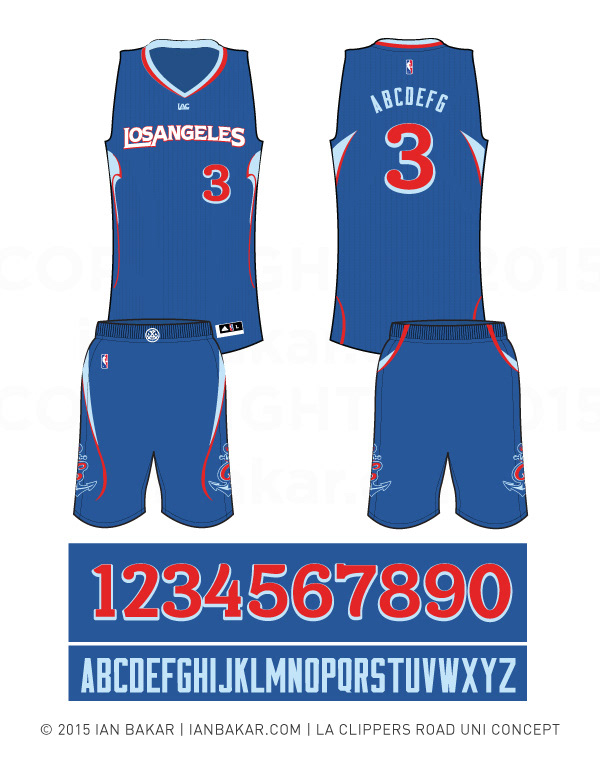
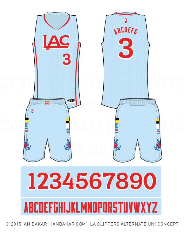
Here’s a rundown of the original concept, for the 2015/16 season:
In 2015, what was revealed to be the new LA Clippers logos leaked online—and the design world & team’s fans both conveyed overwhelmingly negative reactions.
In 2015, what was revealed to be the new LA Clippers logos leaked online—and the design world & team’s fans both conveyed overwhelmingly negative reactions.
From looking like an EA sports game cover, to MS clip art (what are the odds)—the reception was simply not at all what a professional sports team, debuting the first rebrand in the team’s modern history, would ever want to see.
The leaks and their reviews:
I saw this as an opportunity to steer the Clippers visual identity in a different direction — original elements from the 2015/16 concept, below: